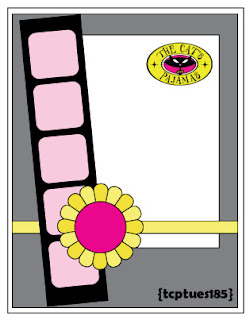
When I went to "Art School" and they taught me about good design, they said that if you take a good design, you can turn it on its side, rotate it and if it still looks balanced, you have a good design.
A good sketch is the same way, you can rotate it, flip it, turn it on its side and it still works as a good design to base your cards on. And a good sketch doesn't have to be literal. You saw how Leigh, our Hostess with the Mostess, flipped her own sketch to a horizontal layout and used the Cloud Border instead of the filmstrip in the sketch.
How about Amy? She changed out the filmstrip for knitting needles and made her main panels much larger.
Jackie had a Beary good time with this sketch. The gal is the queen of the tilted panel.
And Jen, she stayed true to the sketch, but she used a panel of patterned paper and made the embellishment a heart. Sweet!
And newly crowned Dirty Dozen gal, Julie, she shows off some mad skillz with her pretty little card.
And last but not least, Susan, with her lovely pretty card, or pretty love card.
So have at it Stamper's! Let's see what you can do with our sketch this week. I want to see some mad skillz from you. And you could win a $10 voucher on our website. Word on the street? There's a SALE or two coming up AND a NEW Release on Nov 29. An extra $10 is nothing to sneeze at.


No comments:
Post a Comment